Content Manager
Page summary:
The Content Manager is Strapi’s interface for browsing and editing entries. This documentation gives an overview of the Content Manager and explains the views and how to write content in fields, components, dynamic zones and relational fields.
From the Content Manager, accessible via the main navigation of the admin panel, users can write and manage their content.
Overview
The Content Manager contains the available collection and single content-types which were created beforehand using the Content-type Builder.
Content can be created, managed and published from the 2 categories displayed in the sub navigation of the Content Manager:
-
Collection types, which lists available content-types managing several entries. For each available collection type, multiple entries can be created, which is why each collection type is divided into 2 interfaces:
- the list view, which displays a table with all entries created for that collection type.
- the edit view, which focuses on a chosen entry of your collection type, and from where you can actually manage the content.
-
Single types, which lists available content-types with only one entry. Unlike collection types, which have multiple entries, single types are not created for multiple uses. In other words, there can only be one default entry per available single type. There is therefore no list view in the Single types category.
Click the search icons to use a text search and find one of your content-types and/or entries more quickly!
Specifically for your collection types' entries, you can also use the Filters button to set condition-based filters, which add to one another (i.e., if you set several conditions, only the entries that match all the conditions will be displayed).
When Draft & Publish is enabled for the content type, the Filters menu includes a Status field. You can filter entries by:
- Draft (never published) (entries that have never been published),
- Published (all) (all published entries),
- Published (modified) (published entries with draft changes not yet published),
- or Published (unmodified) (published entries with no draft changes).
Configuration
Both the list view and the edit view can be configured.
Configuring the list view
The list view table can be configured in 2 ways: with a quick configuration directly from the list view, or with a permanent and advanced configuration for more options. Both configurations persist and are specific to each content type.
Quick configuration
The list view can be configured on the fly to choose which fields to display in the table. These display preferences are saved in the browser and persist across page refreshes and navigation.
- Click on the settings button .
- Tick the boxes associated with the field you want to be displayed in the table.
- Untick the boxes associated with the fields you do not want to be displayed in the table.
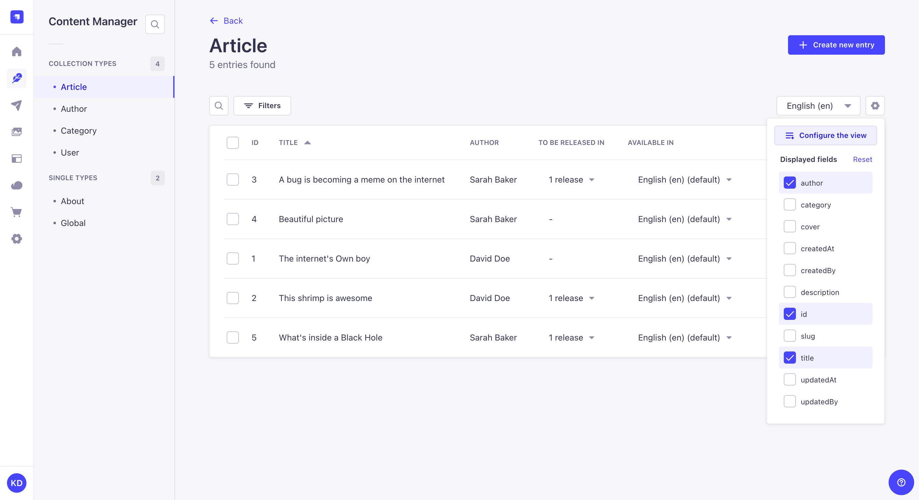
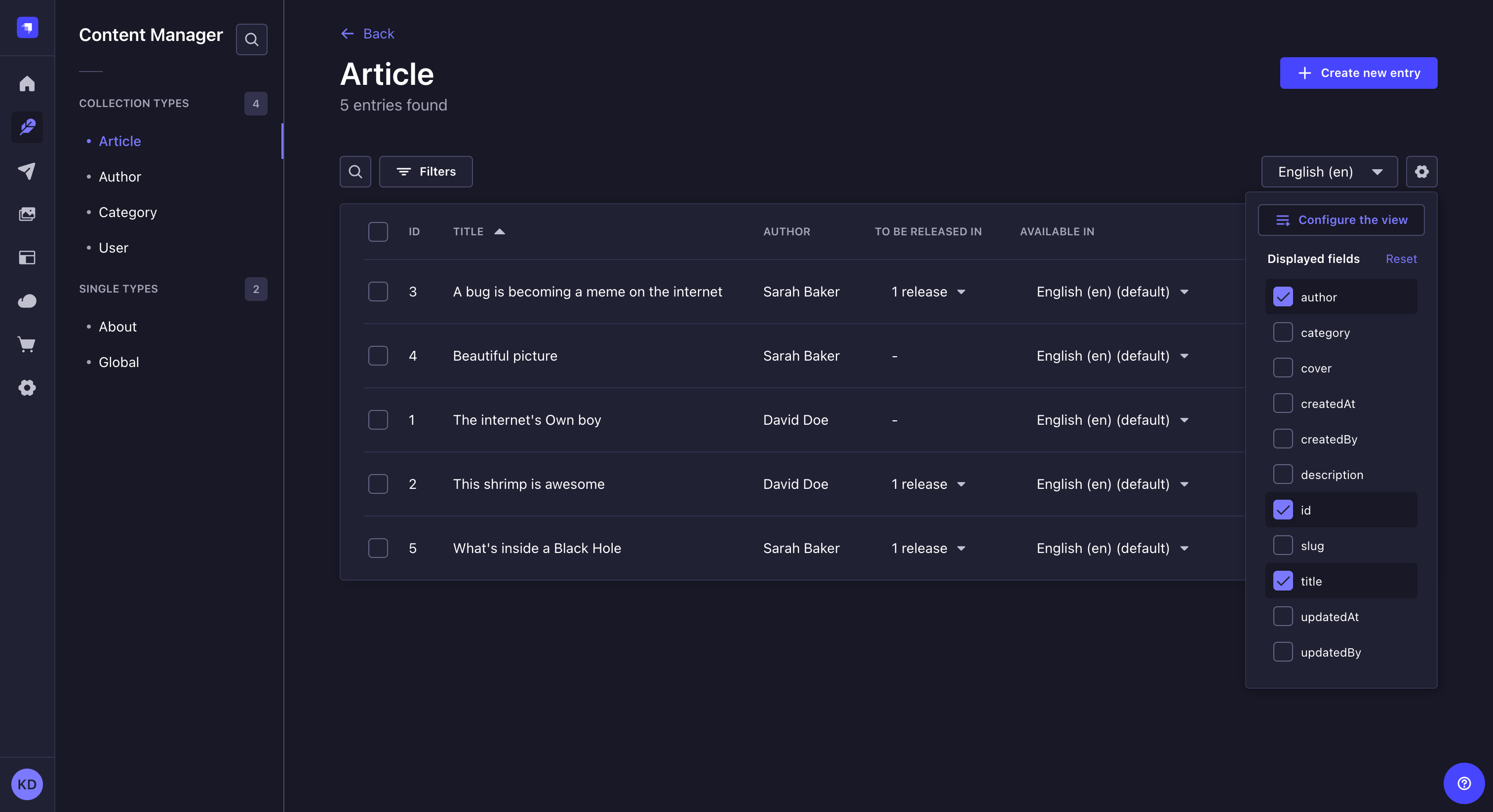
Tick the documentId field if you want handy access to this value for each entry directly from the List view.
Permanent & advanced configuration
For more advanced list view options (e.g., enablement/disablement of search, filters and bulk actions, reordering of the list view table's fields etc.), use the full configuration interface.
The configurations only apply to the list view of the collection type from which the settings are accessed (i.e., disabling the filters or search options for a collection type will not automatically also disable these same options for all other collection types).
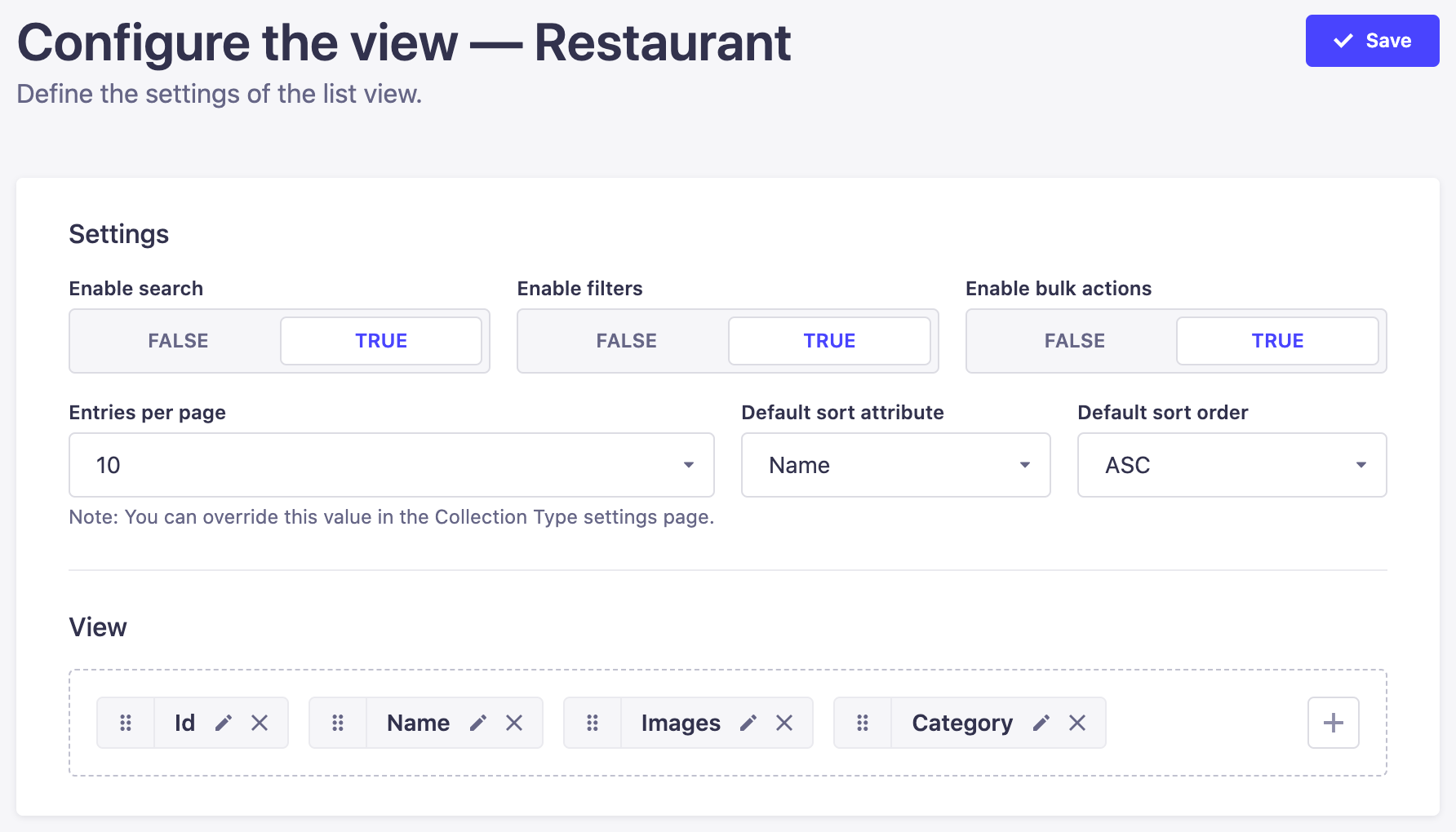
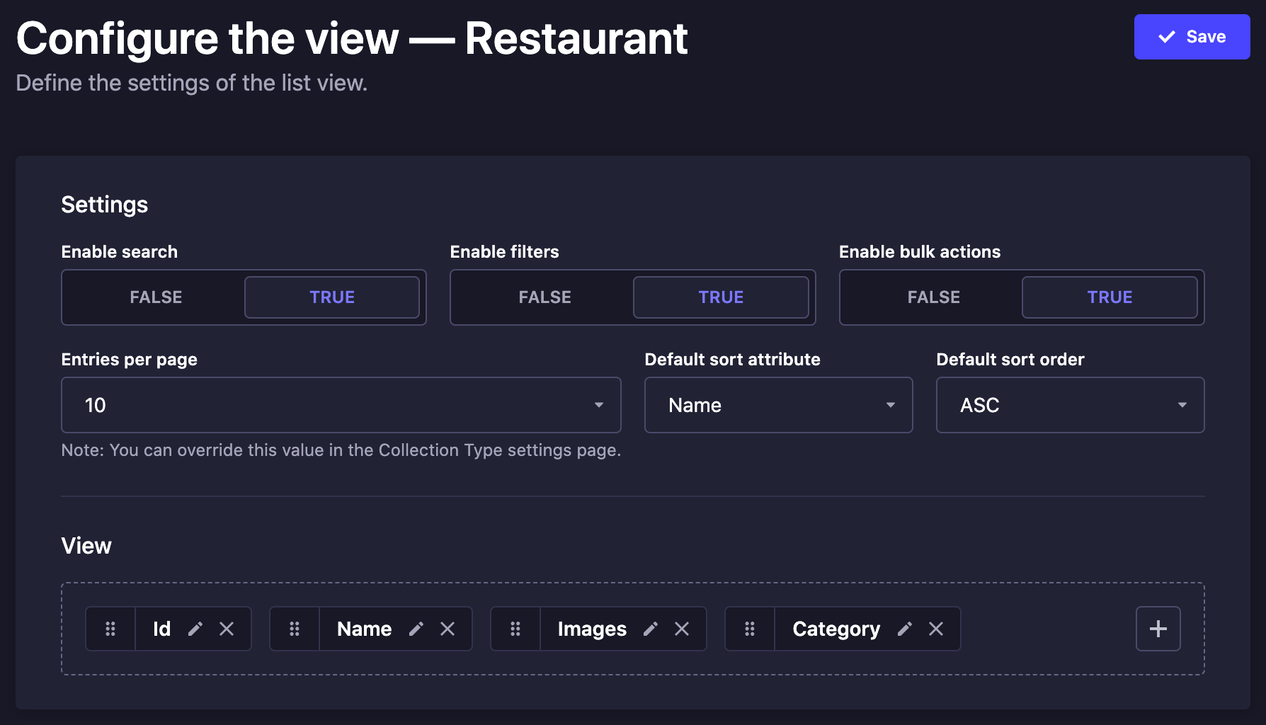
- Settings
- View
- In the list view of your collection type, click on the settings button then Configure the view to be redirected to the list view configuration interface.
- In the Settings area, define your chosen new settings:
| Setting name | Instructions |
|---|---|
| Enable search | Click on TRUE or FALSE to able or disable the search. |
| Enable filters | Click on TRUE or FALSE to able or disable filters. |
| Enable bulk actions | Click on TRUE or FALSE to able or disable the multiple selection boxes in the list view table. |
| Entries per page | Choose among the drop-down list the number of entries per page. |
| Default sort attribute | Choose the sorting field that will be used by default. |
| Default sort order | Choose the sorting type that will be applied by default. |
- Click on the Save button.
- In the list view of your collection type, click on the settings button then Configure the view to be redirected to the list view configuration interface.
- In the View area, define what fields to display in the list view table, and in what order:
- Click the add button to add a new field.
- Click the delete button to remove a field.
- Click the reorder button and drag and drop it to the place you want it to be displayed among the other fields.
- Click the edit button to access its available own settings:
| Setting name | Instructions |
|---|---|
| Label | Write the label to be used for the field in the list view table. |
| Enable sort on this field | Click on TRUE or FALSE to able or disable the sort on the field. |
- Click on the Save button.
Relational fields can also be displayed in the list view. There are however some specificities to keep in mind:
- Only one field can be displayed per relational field.
- Only first-level fields can be displayed (i.e. fields from the relation of a relation can't be displayed).
- If the displayed field contains more than one value, not all its values will be displayed, but a counter indicating the number of values. You can hover this counter to see a tooltip indicating the first 10 values of the relational field.
Note also that relational fields have a couple limitations when it comes to sorting options:
- Sorting cannot be enabled for relational fields which display several fields.
- Relational fields cannot be set as default sort.
Configuring the edit view
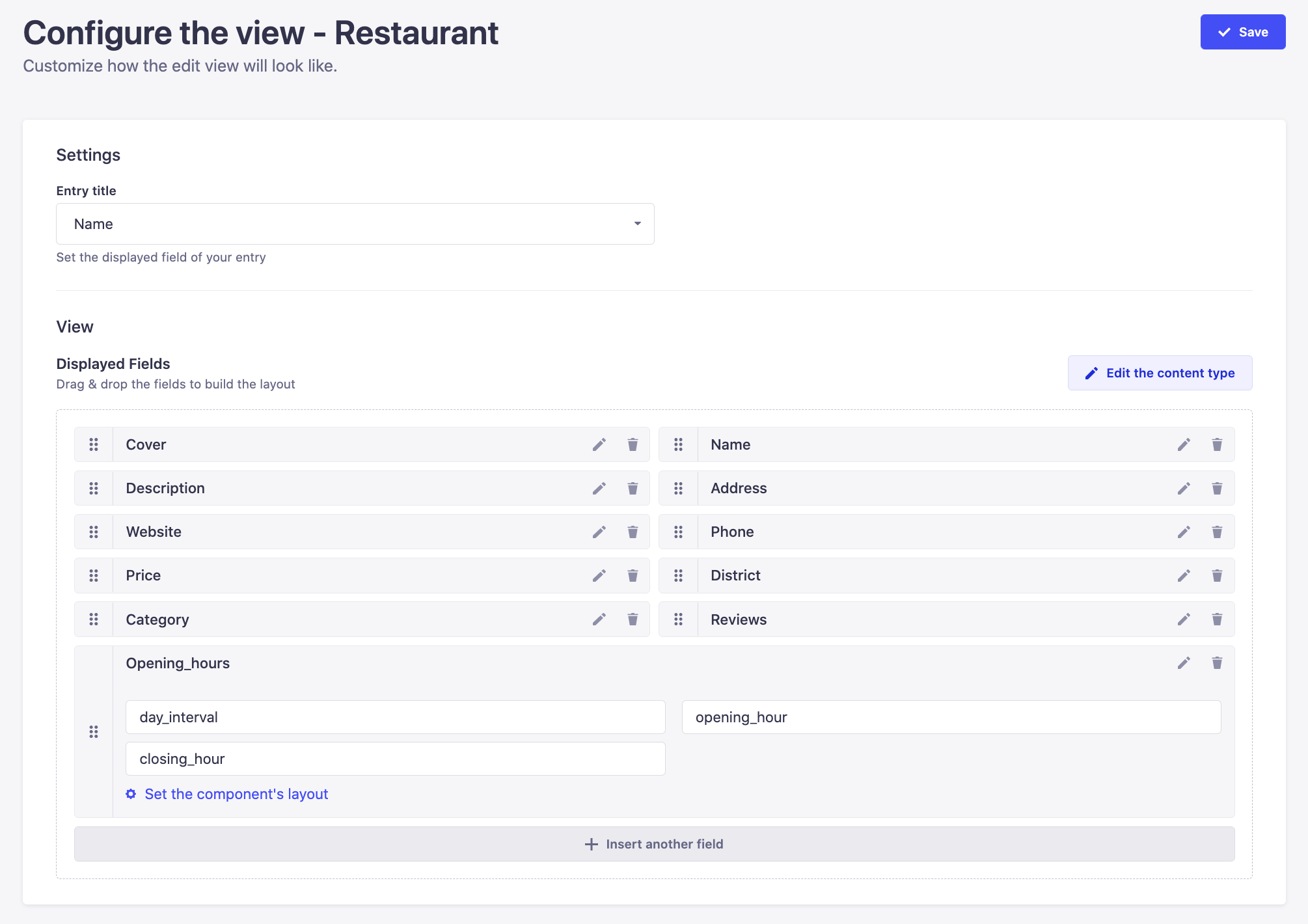
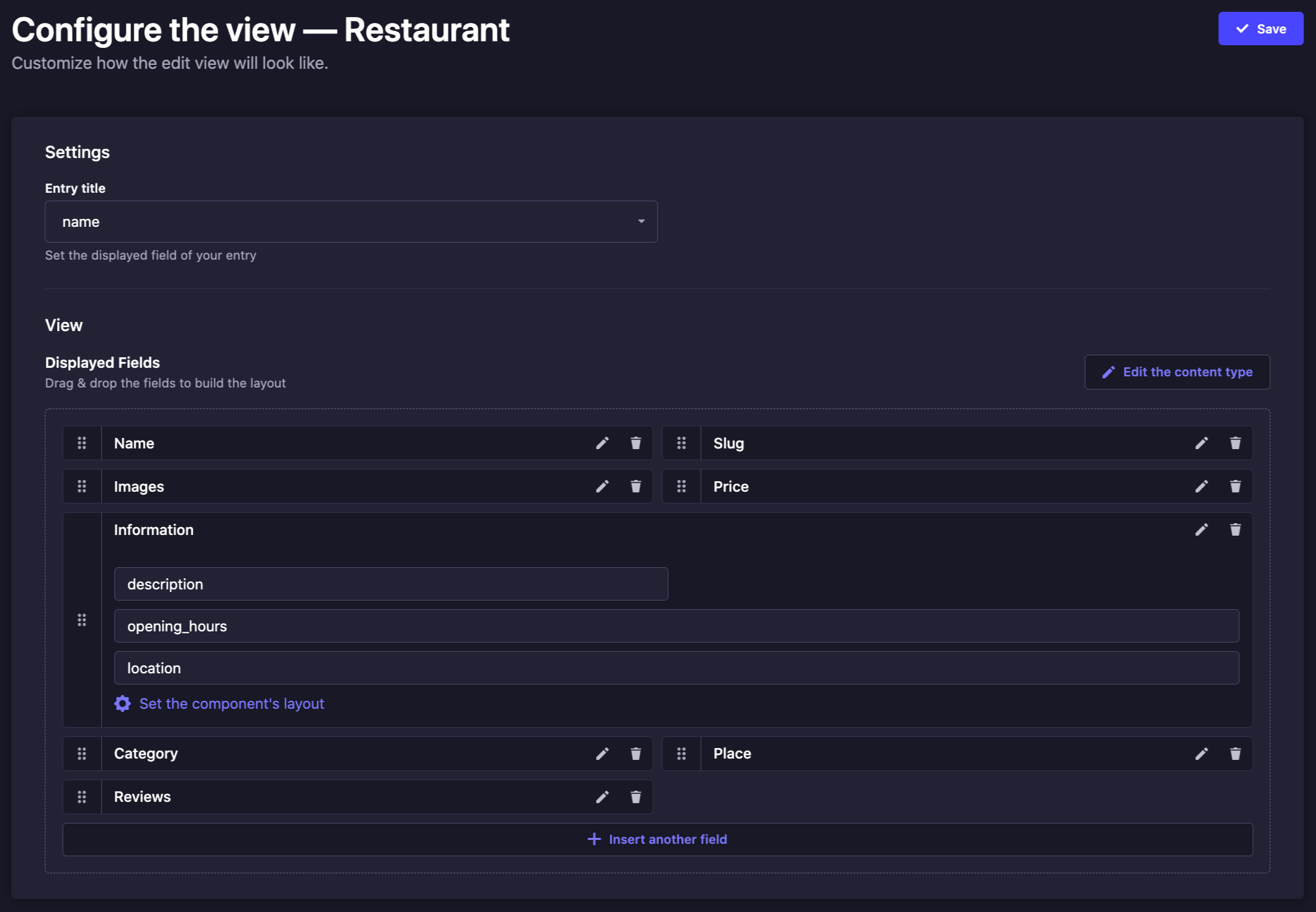
- Settings
- View
- In the edit view of your content-type, click on the button then Configure the view.
- In the Settings area, define your chosen new settings:
| Setting name | Instructions |
|---|---|
| Entry title | Choose among the drop-down list the field that should be used as title for the entry. |
| Relation open behavior | Choose how relation entries open when clicked. Modal (default) opens the entry in an overlay modal. Navigate to page navigates to the entry's full edit page. Open in new tab opens it in a new browser tab. |
- Click on the Save button.
- In the edit view of your content-type, click on the button then Configure the view.
- In the View area, define what fields (including relational fields) to display in the list view table, in what order and what size:
- Click the Insert another field button to add a new field.
- Click the delete button to remove a field.
- Click the reorder button and drag and drop it to the place you want it to be displayed among the other fields.
- Click the edit button of a field to access its available settings:
| Setting name | Instructions |
|---|---|
| Label | Write the label that should be used for the field. |
| Description | Write a description for the field, to help other administrators fill it properly. |
| Placeholder | Write the placeholder that should be displayed by default in the field. |
| Editable field | Click on TRUE or FALSE to able or disable the edition of the field by administrators. |
| Size | Select the size in which the field should be displayed in the Content Manager. Note that this setting is neither available for JSON and Rich Text fields, nor dynamic zones and components. |
| Entry title | (relational fields only) Write the entry title that should be used for the relational field. It is recommended to choose well the entry title of relational fields as the more comprehensive it is, the easier it will be for administrators to manage the content of relational fields from the edit view. |
- Click on the Save button.
The settings and display of a component's fields cannot be managed and reordered through the entry's edit view configuration page. Click on the Set the component's layout button of a component to access the component's own configuration page. You will find the exact same settings and display options as for the entry, but that will specifically apply to your component.
Note also that the settings are defined for the component itself, which means that the settings will automatically be applied for every other content-type where the component is used.
Usage
Creating & Writing content
In Strapi, writing content consists in filling up fields, which are meant to contain specific content (e.g. text, numbers, media, etc.). These fields were configured for the collection or single type beforehand, through the Content-type Builder.
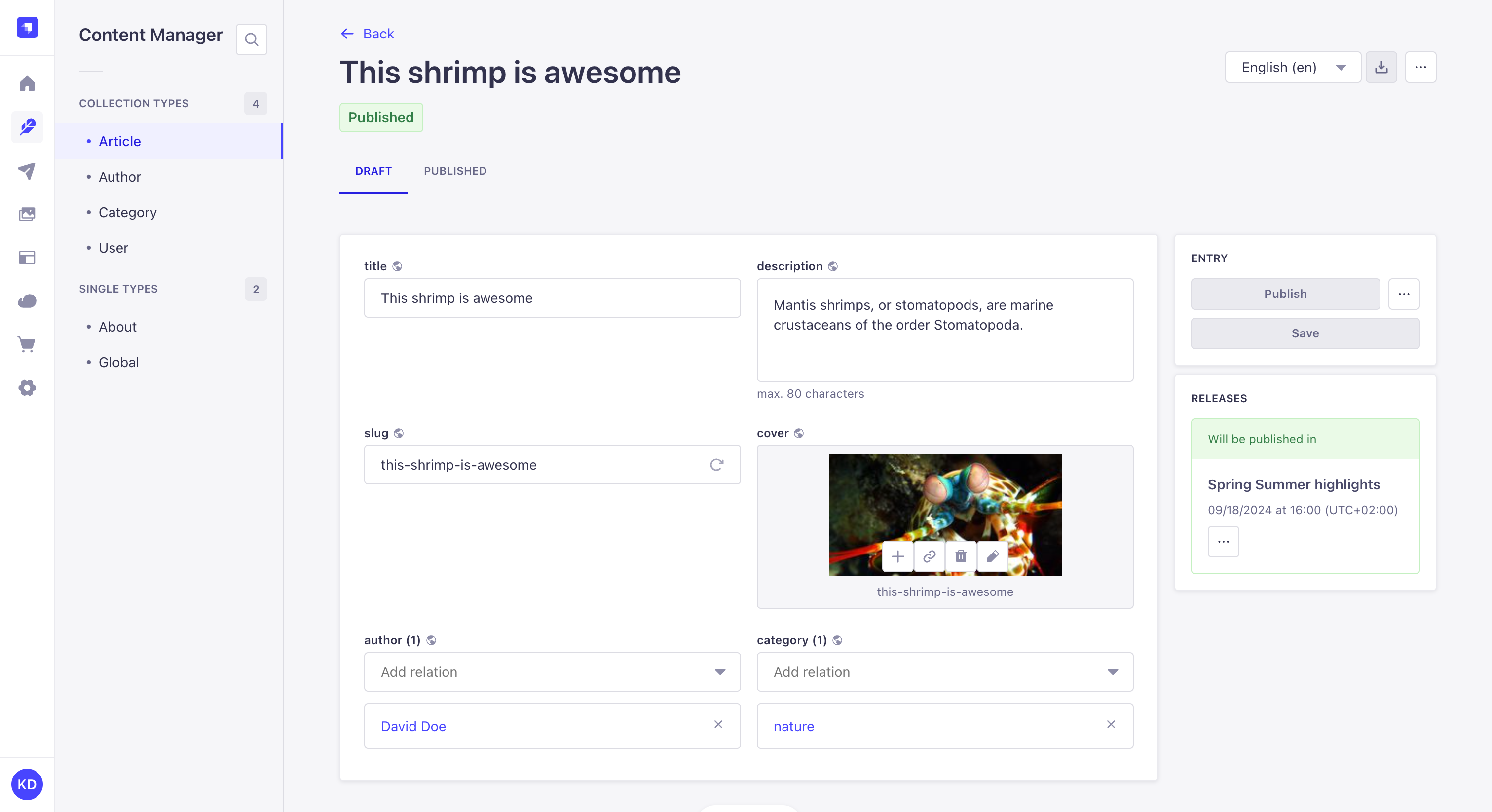
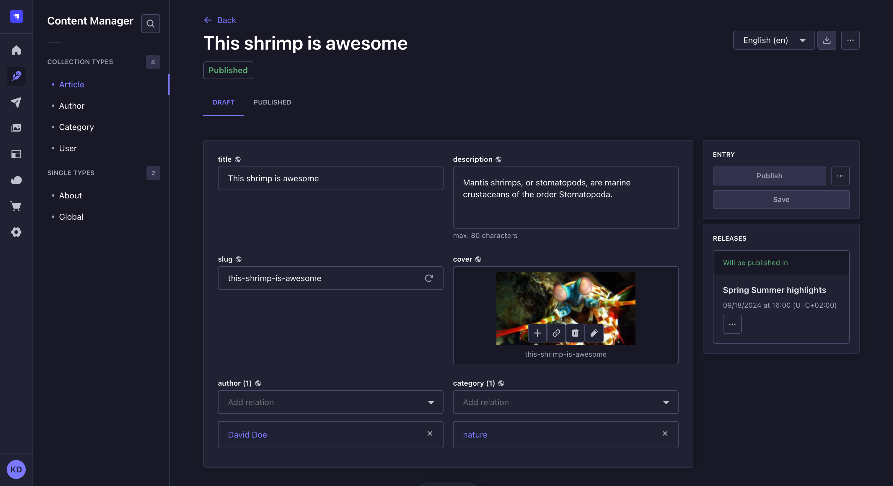
To write or edit content:
- In the Content Manager:
- Either click on the Create new entry button in the top right corner of the collection type of your choice to create a new entry,
- Or access the edit view of your already created collection type's entry or single type.
- Write your content, following the available field schema. You can refer to the table below for more information and instructions on how to fill up each field type.
New entries are only considered created once some of their content has been written and saved once. Only then will the new entry be listed in the list view.
While in the Edit view, click the in the top right corner of the page to view the published, updated, and created dates for the entry. Use the Copy document ID button to copy the value to your clipboard. This is only available for collection type entries.
| Field name | Instructions |
|---|---|
| Text | Write your content in the textbox. |
| Rich text (Markdown) | Write your textual content in the editor, in Markdown. Some basic formatting options (titles, bold, italics, underline) are available in the top bar of the editor to apply to selected text. A Preview mode/Markdown mode button to switch between modes is also available. 💡 The box can be expanded by clicking on Expand in the bottom bar. It displays side by side, at the same time, the textbox that you can edit and the preview. |
| Rich text (Blocks) | Write and manage your content in the editor, which automatically renders live all additions/updates. In the Blocks editor, paragraphs behave as blocks of text: hovering on a paragraph will display an icon on which to click to reorder the content. Options to format or enrich the content are also accessible from the top bar of the editor (basic formatting options, code, links, image etc.). 💡 You can use text formatting keyboard shortcuts in the Blocks editor (e.g. bold, italics, underline, and pasting link). |
| Number | Write your number in the textbox. Up and down arrows, displayed on the right of the box, allow to increase or decrease the current number indicated in the textbox. |
| Date | 1. Click the date and/or time box. 2. Type the date and time or choose a date using the calendar and/or a time from the list. The calendar view fully supports keyboard-based navigation. |
| Media | 1. Click the media area. 2. Choose an asset from the Media Library or from a folder if you created some, or click the Add more assets button to add a new file to the Media Library. 💡 It is possible to drag and drop the chosen file in the media area. |
| Relation | Choose an entry from the drop-down list. See relational fields for more information. |
| Boolean | Click on TRUE or FALSE. |
| JSON | Write your content, in JSON format, in the code textbox. |
| Write a complete and valid email address. | |
| Password | Write a password. 💡 Click the icon, displayed on the right of the box, to show the password. |
| Enumeration | 1. Click the drop-down list. 2. Choose an entry from the list. |
| UID | Write a unique identifier in the textbox. A "Regenerate" button, displayed on the right of the box, allows automatically generating a UID based on the content type name. |
Filling out a custom field depends on the type of content handled by the field. Please refer to the dedicated documentation for each custom field hosted on the Marketplace.
Components
Components are a combination of several fields, which are grouped together in the edit view. Writing their content works exactly like for independent fields, but there are some specificities to components.
There are 2 types of components: non-repeatable and repeatable components.
- Non-repeatable components
- Repeatable components


Non-repeatable components are a combination of fields that can be used only once.
By default, the combination of fields is not directly displayed in the edit view:
- Click on the add button to add the component.
- Fill in the fields of the component.
To delete the non-repeatable component, click on the delete button , located in the top right corner of the component area.
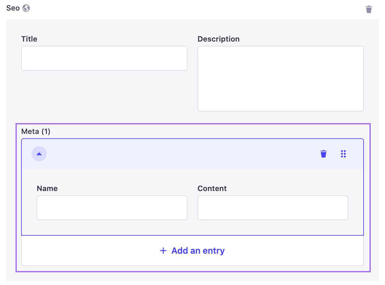
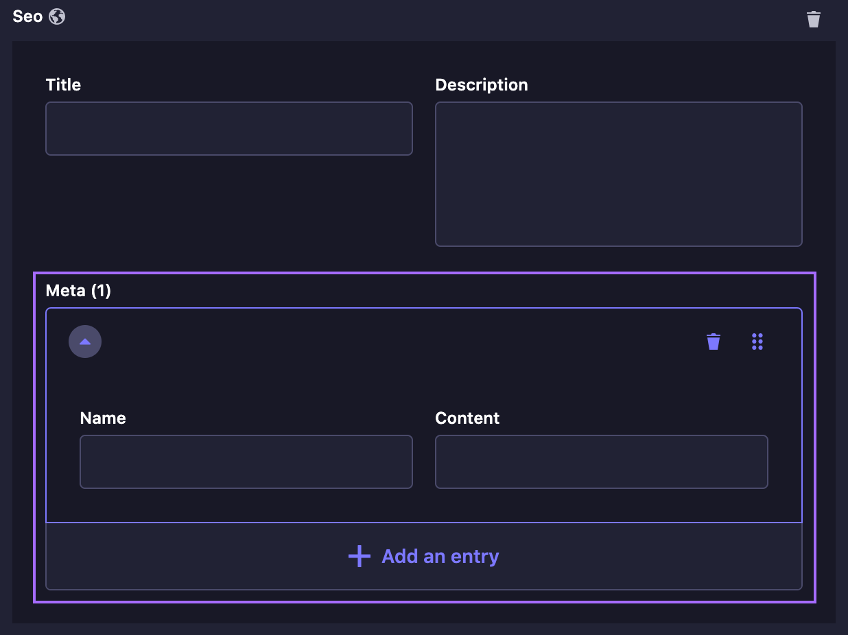
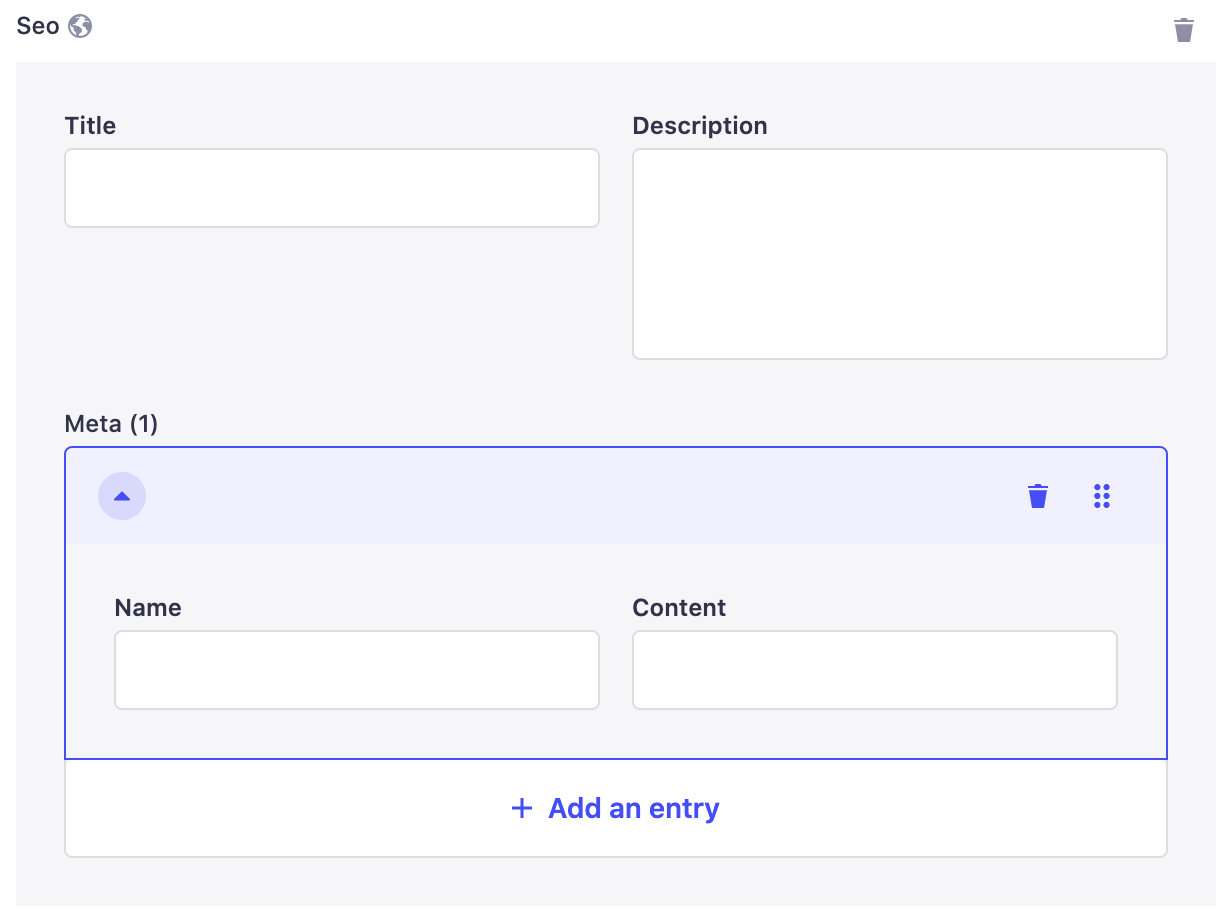
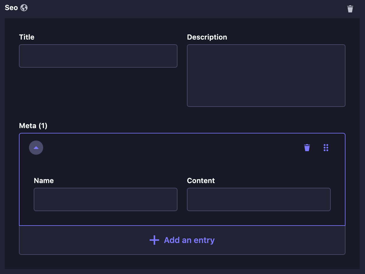
Repeatable components are also a combination of fields, but they allow the creation of multiple component entries, all following the same combination of fields.
To add a new entry and display its combination of fields:
- Click on the add button to add the component.
- Fill in the fields of the component.
- (optional) Click on the Add an entry button and fill in the fields again.
The repeatable component entries can be reordered or deleted directly in the edit view, using buttons displayed on the right of the entry area.
- Use the drag & drop button to reorder entries of your repeatable component.
- Use the delete button to delete an entry from your repeatable component.
Unlike regular fields, the order of the entries of a repeatable component is important. It should correspond exactly to how end users will read/see the content.
Dynamic zones
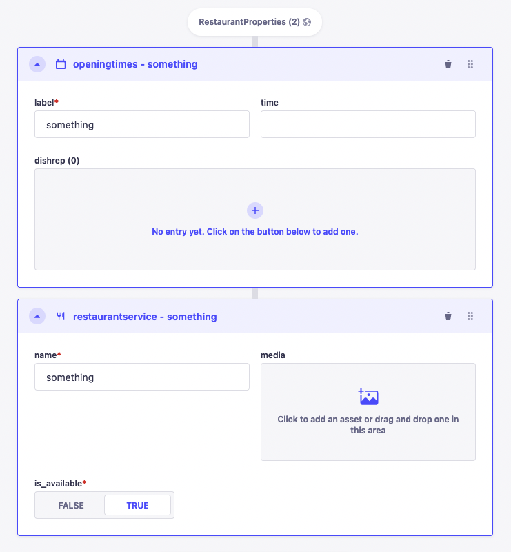
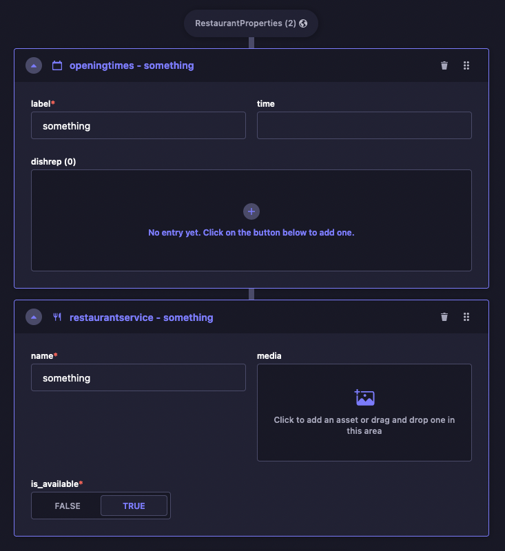
Dynamic zones are a combination of components, which themselves are composed of several fields. Writing the content of a dynamic zone requires additional steps in order to access the fields.
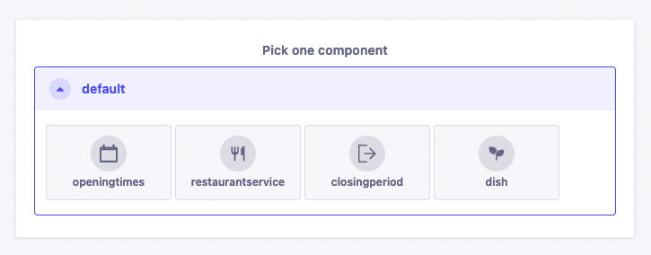
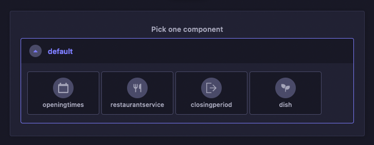
- Click on the Add a component to [dynamic zone name] button.
- Choose a component available for the dynamic zone.
- Fill in the fields of the component.
Dynamic zones' components can also be reordered or deleted directly in the edit view, using buttons displayed in the top right corner of the component area.
- Use the drag & drop button to reorder components in your dynamic zone.
- Use the delete button to delete a component from your dynamic zone.
You can also use the keyboard to reorder components: focus the component using Tab, press Space on the drag & drop button and use the arrow keys to then re-order, pressing Space again to drop the item.
Unlike regular fields, the order of the fields and components inside a dynamic field is important. It should correspond exactly to how end users will read/see the content.
Relational fields
Relation-type fields added to a content-type allow establishing a relation with another collection type. These fields are called "relational fields".
The content of relational fields is written from the edit view of the content-type they belong to. However, relational fields can point to one or several entries of the other collection type, this is why in the Content Manager it is possible to manage a content-type's relational fields to choose which entries are relevant.
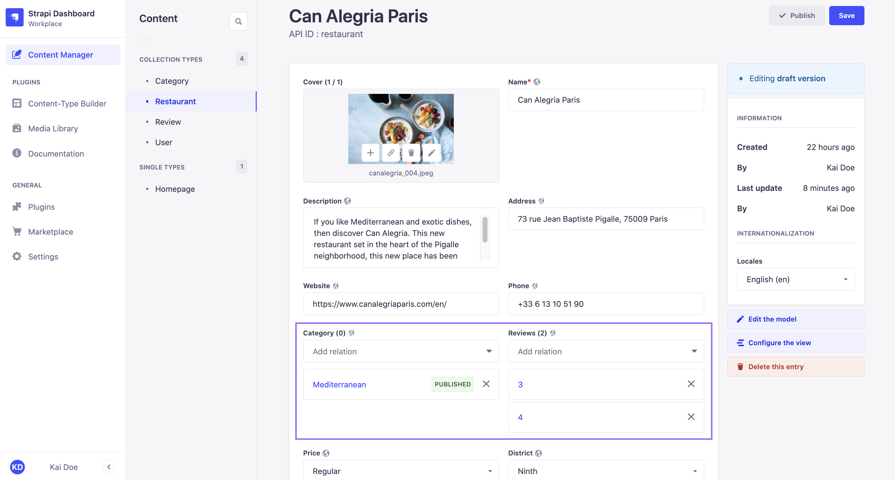
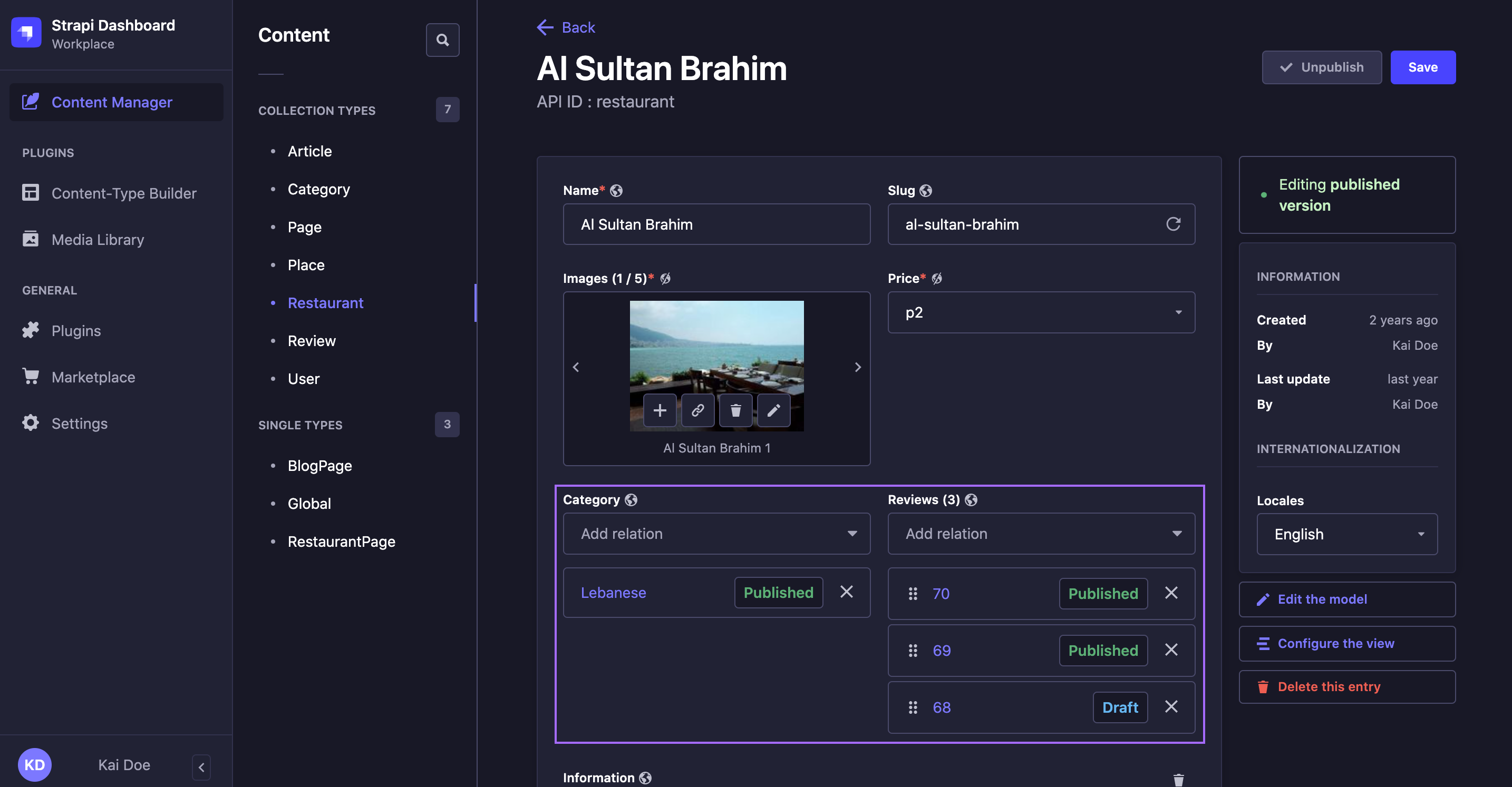
Example of relational fields
In my Strapi admin panel I have created 2 collection types:
- Restaurant, where each entry is a restaurant
- Category, where each entry is a type of restaurant
I want to assign a category to each of my restaurants, therefore I have established a relation between my 2 collection types: restaurants can have one category.
In the Content Manager, from the edit view of my Restaurant entries, I can manage the Category relational field, and choose which entry of Category is relevant for my restaurant.
- One-choice relational fields
- Multiple-choice relational fields
Many-to-one, one-to-one, and one-way types of relation only allow to choose one entry per relational field.
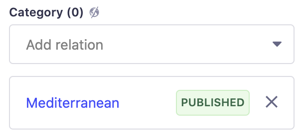
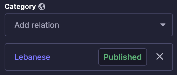
To select the only relevant relational field's entry:
- In the content-type's edit view, click on the drop-down list of the relational field.
- Among the list of entries, choose one.
To remove the entry selected in the drop-down list, click on the delete button .
Many-to-many, one-to-many, and many-ways types of relation allow to choose several entries per relational field.
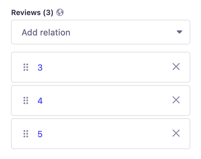
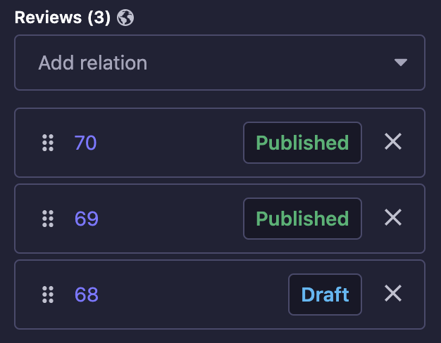
To select the relevant relational field's entries:
- In the content-type's edit view, click on the drop-down list of the relational field.
- Among the list of entries, choose one.
- Repeat step 2 until all relevant entries have been chosen.
To remove an entry, click on the cross button in the selected entries list.
Entries from multiple-choice relational fields can be reordered, indicated by a drag button . To move an entry, click and hold it, drag it to the desired position, then release it.
-
Not all entries are listed by default: more can be displayed by clicking on the Load more button. Also, instead of choosing an entry by scrolling the list, you can click any relational field drop-down list and type to search a specific entry.
-
Click on the name of an entry to open it. The behavior depends on the Relation open behavior setting configured in the edit view: the entry opens in a modal (default), navigates to its full edit page, or opens in a new browser tab. See Configuring the edit view to change this setting.
- If the Draft & Publish feature is activated for the content-type the relational field belongs to, you will notice blue or green dots next to the entries names in the drop-down list. They indicate the status of the entry, respectively draft or published content.
- If the Internationalization (i18n) feature is enabled for the content-type, the list of entries may be limited or differ from one locale to another. Only relevant entries that can possibly be chosen for a relational field will be listed.
Deleting content
You can delete content by deleting any entry of a collection type, or the default entry of a single type.
- In the edit view of the entry, click on at the top right of the interface, and click the Delete document button.
If Internationalization is enabled for the content-type, you can also choose to delete only the currently selected locale by clicking on the Delete locale button. - In the window that pops up, click on the Confirm button to confirm the deletion.
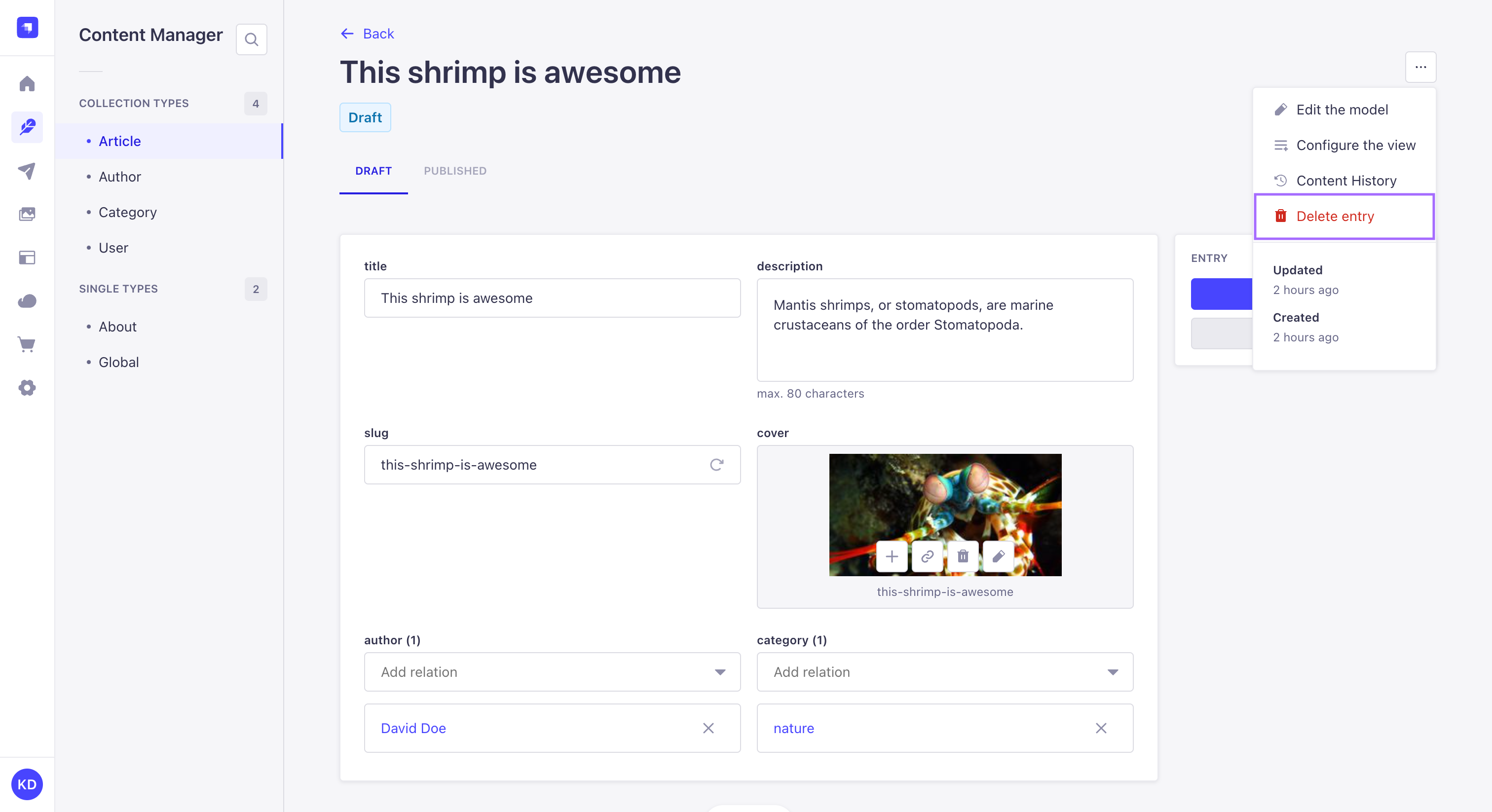
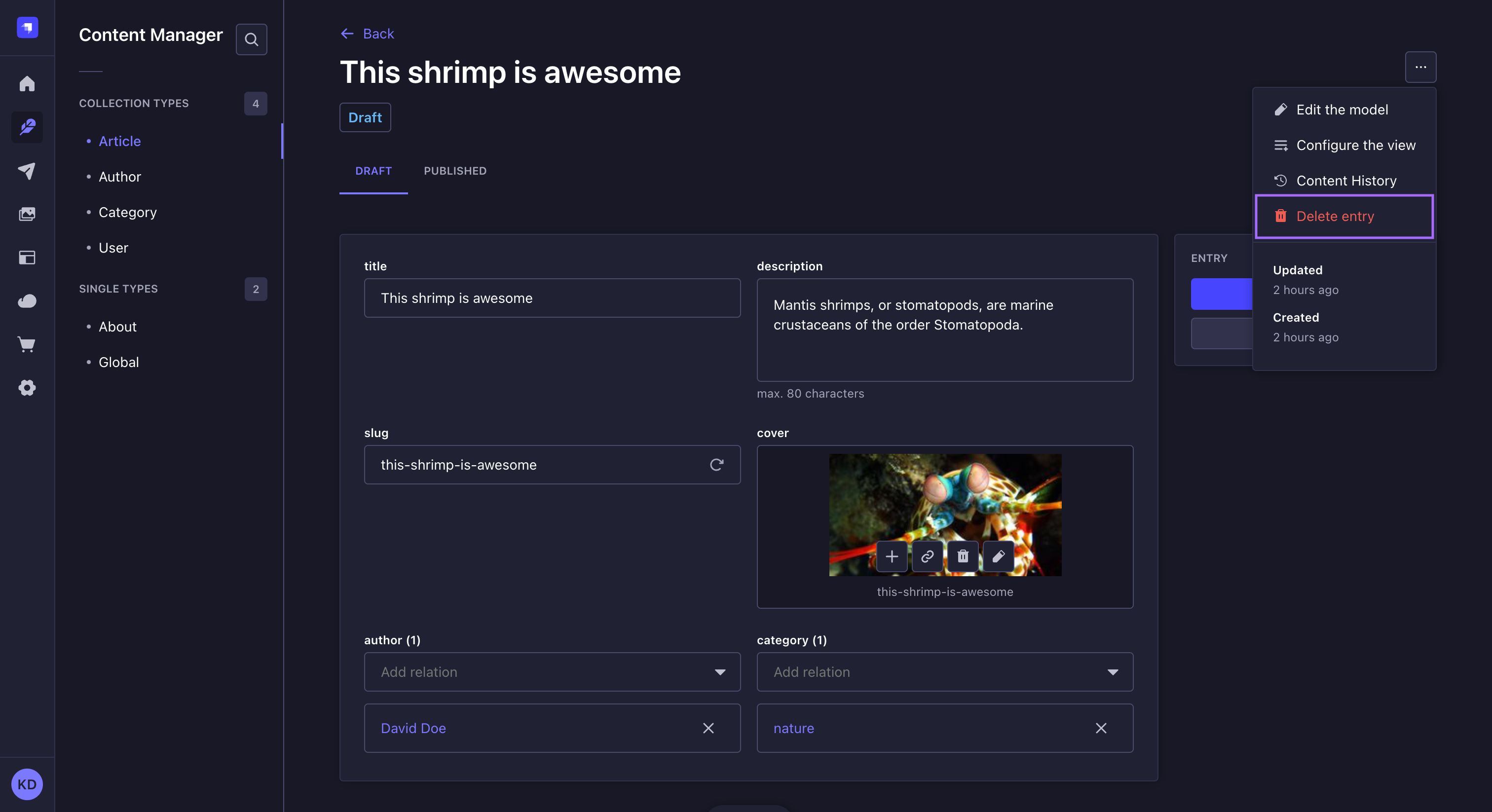
You can delete entries from the list view of a collection type, by clicking on on the right side of the entry's record in the table, then choosing the Delete document button.
If Internationalization is enabled for the content-type, Delete document deletes all locales while Delete locale only deletes the currently listed locale.