Homepage customization
Page summary:The admin panel homepage displays default content and profile widgets and supports custom additions through the
app.widgets.registerAPI.
The Homepage is the landing page of the Strapi admin panel. By default, it provides an overview of your content with 6 default widgets:
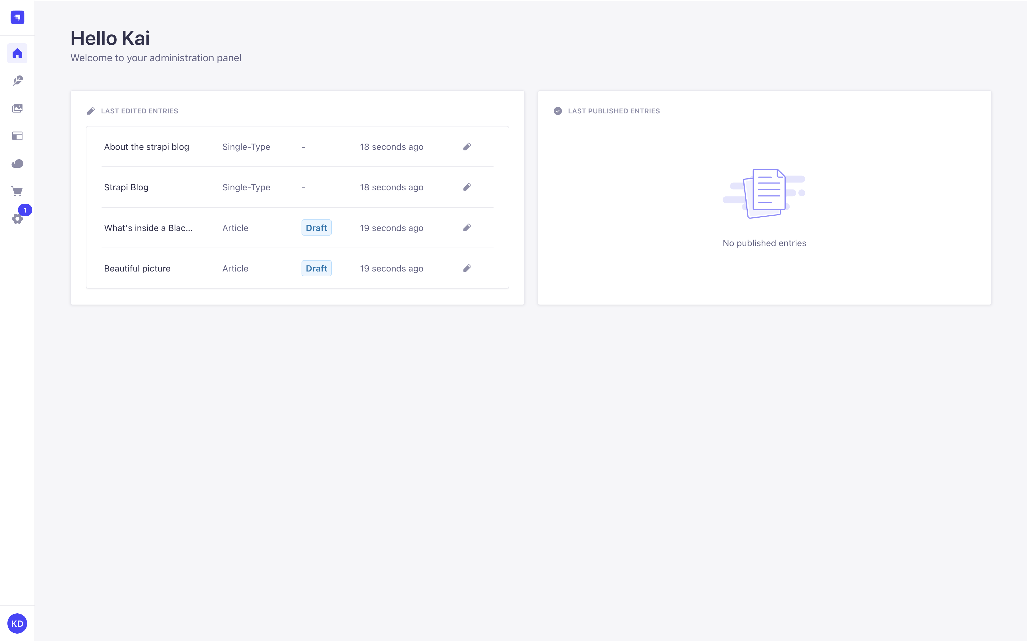
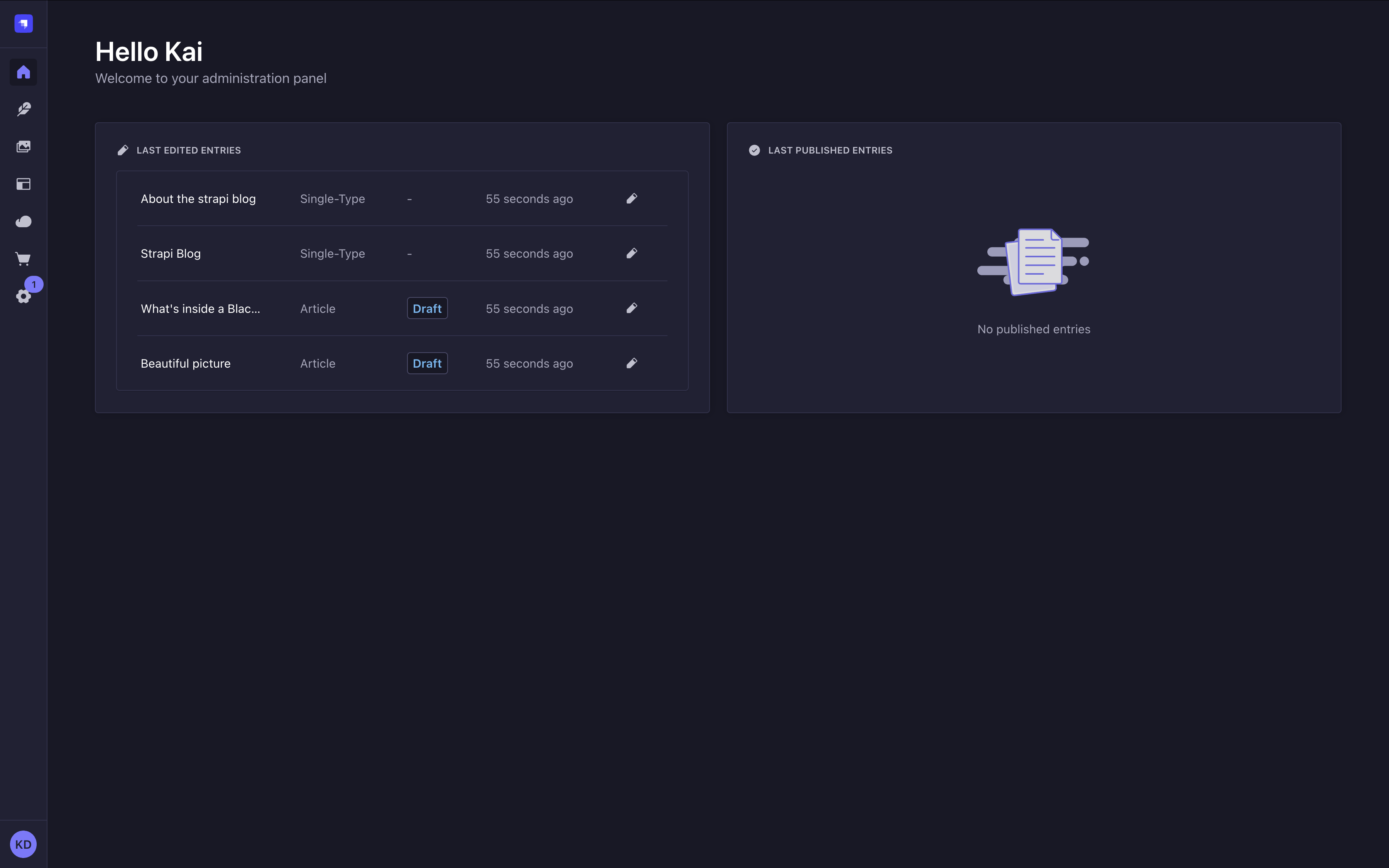
- Last edited entries: Displays recently modified content entries, including their content type, status, and when they were updated.
- Last published entries: Shows recently published content entries, allowing you to quickly access and manage your published content.
- Profile: Displays a short summary of your profile, including your name, email address, and role.
- Entries: Displays the total number of Draft & Published entries.
- Project statistics: Displays statistics about your entries, content-types, locales, assets, and more.
- Deploy: Displays a Deploy Now button that links to Strapi Cloud for deploying your project. This widget is only displayed in local development and is hidden when the application runs in production.
These default widgets cannot currently be removed, but you can customize the Homepage by creating your own widgets.
If you recently created a Strapi project, the Homepage may also display a guided tour above widgets if you haven't skipped it yet (see Admin Panel documentation for details).
Adding custom widgets
To add a custom widget, you can:
- install a plugin from the Marketplace
- or create and register your own widgets
The present page will describe how to create and register your widgets.
Registering custom widgets
To register a widget, use app.widgets.register():
- in the plugin’s
registerlifecycle method of theindexfile if you're building a plugin (recommended way), - or in the application's global
register()lifecycle method if you're adding the widget to just one Strapi application without a plugin.
The examples on the present page will cover registering a widget through a plugin. Most of the code should be reusable if you register the widget in the application's global register() lifecycle method, except you should not pass the pluginId property.
- JavaScript
- TypeScript
import pluginId from './pluginId';
import MyWidgetIcon from './components/MyWidgetIcon';

export default {
  register(app) {
    // Register the plugin itself
    app.registerPlugin({
      id: pluginId,
      name: 'My Plugin',
    });

    // Register a widget for the Homepage
    app.widgets.register({
      icon: MyWidgetIcon,
      title: {
        id: `${pluginId}.widget.title`,
        defaultMessage: 'My Widget',
      },
      component: async () => {
        const component = await import('./components/MyWidget');
        return component.default;
      },
      /**
       * Use this instead if you used a named export for your component
       */
      // component: async () => {
      //   const { Component } = await import('./components/MyWidget');
      //   return Component;
      // },
      id: 'my-custom-widget',
      pluginId: pluginId,
    });
  },

  bootstrap() {},
  // ...
};
import pluginId from './pluginId';
import MyWidgetIcon from './components/MyWidgetIcon';
import type { StrapiApp } from '@strapi/admin/strapi-admin';

export default {
  register(app: StrapiApp) {
    // Register the plugin itself
    app.registerPlugin({
      id: pluginId,
      name: 'My Plugin',
    });

    // Register a widget for the Homepage
    app.widgets.register({
      icon: MyWidgetIcon,
      title: {
        id: `${pluginId}.widget.title`,
        defaultMessage: 'My Widget',
      },
      component: async () => {
        const component = await import('./components/MyWidget');
        return component.default;
      },
      /**
       * Use this instead if you used a named export for your component
       */
      // component: async () => {
      //   const { Component } = await import('./components/MyWidget');
      //   return Component;
      // },
      id: 'my-custom-widget',
      pluginId: pluginId,
    });
  },

  bootstrap() {},
  // ...
};
The app.widgets.register API only works with Strapi 5.13 and above. Trying to call the API with older versions of Strapi will crash the admin panel.
Plugin developers who want to register widgets should either:
-
set
^5.13.0as their@strapi/strapipeerDependency in their pluginpackage.json. This peer dependency powers the Marketplace's compatibility check. -
or check if the API exists before calling it:
if ('widgets' in app) {
  // proceed with the registration
}
The peerDependency approach is recommended if the whole purpose of the plugin is to register widgets. The second approach makes more sense if a plugin wants to add a widget but most of its functionality is elsewhere.
Widget API reference
The app.widgets.register() method can take either a single widget configuration object or an array of configuration objects. Each widget configuration object can accept the following properties:
| Property | Type | Description | Required |
|---|---|---|---|
icon | React.ComponentType | Icon component to display beside the widget title | Yes |
title | MessageDescriptor | Title for the widget with translation support | Yes |
component | () => Promise<React.ComponentType> | Async function that returns the widget component | Yes |
id | string | Unique identifier for the widget | Yes |
link | Object | Optional link to add to the widget (see link object properties) | No |
pluginId | string | ID of the plugin registering the widget | No |
permissions | Permission[] | Permissions required to view the widget | No |
Link object properties:
If you want to add a link to your widget (e.g., to navigate to a detailed view), you can provide a link object with the following properties:
| Property | Type | Description | Required |
|---|---|---|---|
label | MessageDescriptor | The text to display for the link | Yes |
href | string | The URL where the link should navigate to | Yes |
Creating a widget component
Widget components should be designed to display content in a compact and informative way.
Here's how to implement a basic widget component:
- JavaScript
- TypeScript
import React, { useState, useEffect } from 'react';
import { Widget } from '@strapi/admin/strapi-admin';

const MyWidget = () => {
  const [loading, setLoading] = useState(true);
  const [data, setData] = useState(null);
  const [error, setError] = useState(null);

  useEffect(() => {
    // Fetch your data here
    const fetchData = async () => {
      try {
        // Replace with your actual API call
        const response = await fetch('/my-plugin/data');
        const result = await response.json();

        setData(result);
        setLoading(false);
      } catch (err) {
        setError(err);
        setLoading(false);
      }
    };

    fetchData();
  }, []);

  if (loading) {
    return <Widget.Loading />;
  }

  if (error) {
    return <Widget.Error />;
  }

  if (!data || data.length === 0) {
    return <Widget.NoData />;
  }

  return (
    <div>
      {/* Your widget content here */}
      <ul>
        {data.map((item) => (
          <li key={item.id}>{item.name}</li>
        ))}
      </ul>
    </div>
  );
};

export default MyWidget;
import React, { useState, useEffect } from 'react';
import { Widget } from '@strapi/admin/strapi-admin';

interface DataItem {
  id: number;
  name: string;
}

const MyWidget: React.FC = () => {
  const [loading, setLoading] = useState<boolean>(true);
  const [data, setData] = useState<DataItem[] | null>(null);
  const [error, setError] = useState<Error | null>(null);

  useEffect(() => {
    // Fetch your data here
    const fetchData = async () => {
      try {
        // Replace with your actual API call
        const response = await fetch('/my-plugin/data');
        const result = await response.json();

        setData(result);
        setLoading(false);
      } catch (err) {
        setError(err instanceof Error ? err : new Error(String(err)));
        setLoading(false);
      }
    };

    fetchData();
  }, []);

  if (loading) {
    return <Widget.Loading />;
  }

  if (error) {
    return <Widget.Error />;
  }

  if (!data || data.length === 0) {
    return <Widget.NoData />;
  }

  return (
    <div>
      {/* Your widget content here */}
      <ul>
        {data.map((item) => (
          <li key={item.id}>{item.name}</li>
        ))}
      </ul>
    </div>
  );
};

export default MyWidget;
For simplicity, the example below uses data fetching directly inside a useEffect hook. While this works for demonstration purposes, it may not reflect best practices in production.
For more robust solutions, consider alternative approaches recommended in the React documentation. If you're looking to integrate a data fetching library, we recommend using TanStackQuery.
Data management:
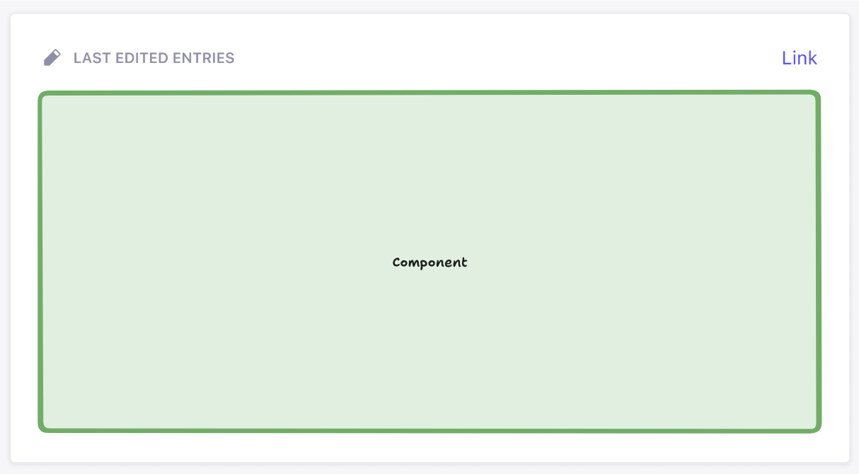
The green box above represents the area where the user’s React component (from widget.component in the API) is rendered. You can render whatever you like inside of this box. Everything outside that box is, however, rendered by Strapi. This ensures overall design consistency within the admin panel. The icon, title, and link (optional) properties provided in the API are used to display the widget.
Widget helper components reference
Strapi provides several helper components to maintain a consistent user experience across widgets:
| Component | Description | Usage |
|---|---|---|
Widget.Loading | Displays a loading spinner and message | When data is being fetched |
Widget.Error | Displays an error state | When an error occurs |
Widget.NoData | Displays when no data is available | When the widget has no data to show |
Widget.NoPermissions | Displays when user lacks required permissions | When the user cannot access the widget |
These components help maintain a consistent look and feel across different widgets.
You could render these components without children to get the default wording: <Widget.Error />
or you could pass children to override the default copy and specify your own wording: <Widget.Error>Your custom error message</Widget.Error>.
Example: Adding a content metrics widget
The following is a complete example of how to create a content metrics widget that displays the number of entries for each content type in your Strapi application.
The end result will look like the following in your admin panel's Homepage:
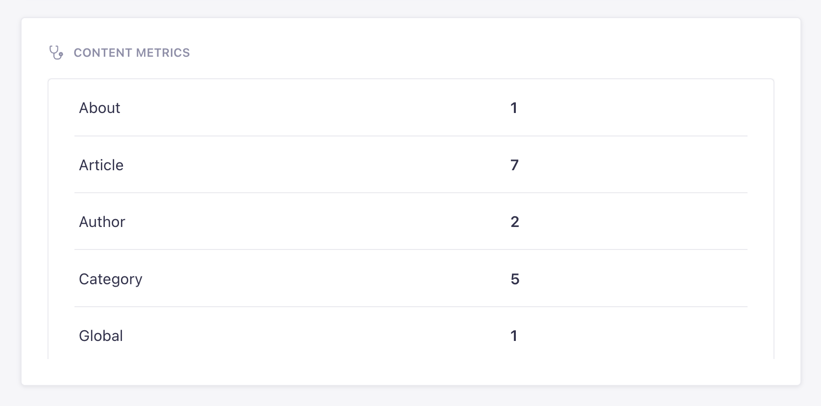
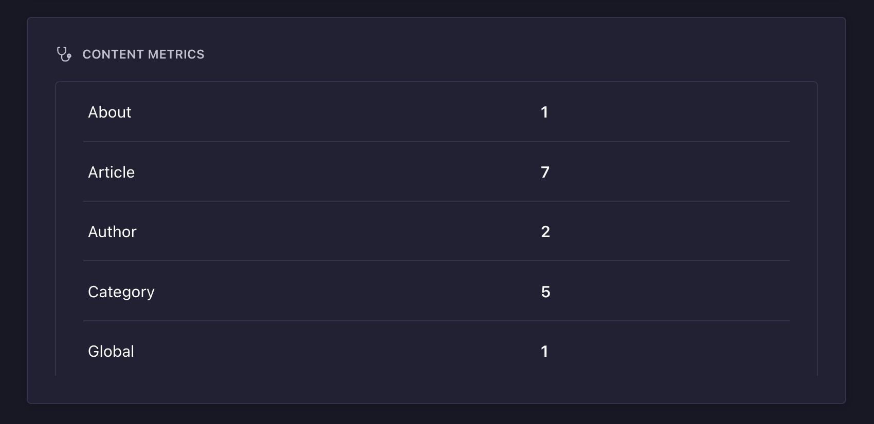
The widget shows counts for example content-types automatically generated by Strapi when you provide the --example flag on installation (see CLI installation options for details).
This widget can be added to Strapi by:
- creating a "content-metrics" plugin (see plugin creation documentation for details)
- re-using the code examples provided below.
If you prefer a hands-on approach, you can reuse the following CodeSandbox link.
- JavaScript
- TypeScript
The following file registers the plugin and the widget:
import { PLUGIN_ID } from './pluginId';
import { Initializer } from './components/Initializer';
import { PluginIcon } from './components/PluginIcon';
import { Stethoscope } from '@strapi/icons'

export default {
  register(app) {
    app.addMenuLink({
      to: `plugins/${PLUGIN_ID}`,
      icon: PluginIcon,
      intlLabel: {
        id: `${PLUGIN_ID}.plugin.name`,
        defaultMessage: PLUGIN_ID,
      },
      Component: () => import('./pages/App'),
    });

    app.registerPlugin({
      id: PLUGIN_ID,
      initializer: Initializer,
      isReady: false,
      name: PLUGIN_ID,
    });

    // Registers the widget
    app.widgets.register({
      icon: Stethoscope,
      title: {
        id: `${PLUGIN_ID}.widget.metrics.title`,
        defaultMessage: 'Content Metrics',
      },
      component: async () => {
        const component = await import('./components/MetricsWidget');
        return component.default;
      },
      id: 'content-metrics',
      pluginId: PLUGIN_ID,
    });
  },

  async registerTrads({ locales }) {
    return Promise.all(
      locales.map(async (locale) => {
        try {
          const { default: data } = await import(`./translations/${locale}.json`);
          return { data, locale };
        } catch {
          return { data: {}, locale };
        }
      })
    );
  },

  bootstrap() {},
};
The following file defines the widget's component and its logic. It's tapping into a specific controller and route that we'll create for the plugin:
import React, { useState, useEffect } from 'react';
import { Table, Tbody, Tr, Td, Typography, Box } from '@strapi/design-system';
import { Widget } from '@strapi/admin/strapi-admin'

const MetricsWidget = () => {
  const [loading, setLoading] = useState(true);
  const [metrics, setMetrics] = useState(null);
  const [error, setError] = useState(null);

  useEffect(() => {
    const fetchMetrics = async () => {
      try {
        const response = await fetch('/api/content-metrics/count');
        const data = await response.json();

        console.log("data:", data);

        const formattedData = {};

        if (data && typeof data === 'object') {
          Object.keys(data).forEach(key => {
            const value = data[key];
            formattedData[key] = typeof value === 'number' ? value : String(value);
          });
        }

        setMetrics(formattedData);
        setLoading(false);
      } catch (err) {
        console.error(err);
        setError(err.message || 'An error occurred');
        setLoading(false);
      }
    };

    fetchMetrics();
  }, []);

  if (loading) {
    return (
      <Widget.Loading />
    );
  }

  if (error) {
    return (
      <Widget.Error />
    );
  }

  if (!metrics || Object.keys(metrics).length === 0) {
    return <Widget.NoData>No content types found</Widget.NoData>;
  }

  return (
    <Table>
      <Tbody>
        {Object.entries(metrics).map(([contentType, count], index) => (
          <Tr key={index}>
            <Td>
              <Typography variant="omega">{String(contentType)}</Typography>
            </Td>
            <Td>
              <Typography variant="omega" fontWeight="bold">{String(count)}</Typography>
            </Td>
          </Tr>
        ))}
      </Tbody>
    </Table>
  );
};

export default MetricsWidget;
The following file defines a custom controller that counts all content-types:
'use strict';
module.exports = ({ strapi }) => ({
  async getContentCounts(ctx) {
    try {
      // Get all content types
      const contentTypes = Object.keys(strapi.contentTypes)
        .filter(uid => uid.startsWith('api::'))
        .reduce((acc, uid) => {
          const contentType = strapi.contentTypes[uid];
          acc[contentType.info.displayName || uid] = 0;
          return acc;
        }, {});

      // Count entities for each content type
      for (const [name, _] of Object.entries(contentTypes)) {
        const uid = Object.keys(strapi.contentTypes)
          .find(key =>
            strapi.contentTypes[key].info.displayName === name || key === name
          );

        if (uid) {
          // Using the count() method from the Document Service API
          const count = await strapi.documents(uid).count();
          contentTypes[name] = count;
        }
      }

      ctx.body = contentTypes;
    } catch (err) {
      ctx.throw(500, err);
    }
  }
});
The following file ensures that the metrics controller is reachable at a custom /count route:
export default {
  'content-api': {
    type: 'content-api',
    routes: [
      {
        method: 'GET',
        path: '/count',
        handler: 'metrics.getContentCounts',
        config: {
          policies: [],
        },
      },
    ],
  },
};
The following file registers the plugin and the widget:
import { PLUGIN_ID } from './pluginId';
import { Initializer } from './components/Initializer';
import { PluginIcon } from './components/PluginIcon';
import { Stethoscope } from '@strapi/icons'

export default {
  register(app) {
    app.addMenuLink({
      to: `plugins/${PLUGIN_ID}`,
      icon: PluginIcon,
      intlLabel: {
        id: `${PLUGIN_ID}.plugin.name`,
        defaultMessage: PLUGIN_ID,
      },
      Component: () => import('./pages/App'),
    });

    app.registerPlugin({
      id: PLUGIN_ID,
      initializer: Initializer,
      isReady: false,
      name: PLUGIN_ID,
    });

    // Registers the widget
    app.widgets.register({
      icon: Stethoscope,
      title: {
        id: `${PLUGIN_ID}.widget.metrics.title`,
        defaultMessage: 'Content Metrics',
      },
      component: async () => {
        const component = await import('./components/MetricsWidget');
        return component.default;
      },
      id: 'content-metrics',
      pluginId: PLUGIN_ID,
    });
  },

  async registerTrads({ locales }) {
    return Promise.all(
      locales.map(async (locale) => {
        try {
          const { default: data } = await import(`./translations/${locale}.json`);
          return { data, locale };
        } catch {
          return { data: {}, locale };
        }
      })
    );
  },

  bootstrap() {},
};
The following file defines the widget's component and its logic. It's tapping into a specific controller and route that we'll create for the plugin:
import React, { useState, useEffect } from 'react';
import { Table, Tbody, Tr, Td, Typography, Box } from '@strapi/design-system';
import { Widget } from '@strapi/admin/strapi-admin'

const MetricsWidget = () => {
  const [loading, setLoading] = useState(true);
  const [metrics, setMetrics] = useState(null);
  const [error, setError] = useState(null);

  useEffect(() => {
    const fetchMetrics = async () => {
      try {
        const response = await fetch('/api/content-metrics/count');
        const data = await response.json();

        console.log("data:", data);

        const formattedData = {};

        if (data && typeof data === 'object') {
          Object.keys(data).forEach(key => {
            const value = data[key];
            formattedData[key] = typeof value === 'number' ? value : String(value);
          });
        }

        setMetrics(formattedData);
        setLoading(false);
      } catch (err) {
        console.error(err);
        setError(err.message || 'An error occurred');
        setLoading(false);
      }
    };

    fetchMetrics();
  }, []);

  if (loading) {
    return (
      <Widget.Loading />
    );
  }

  if (error) {
    return (
      <Widget.Error />
    );
  }

  if (!metrics || Object.keys(metrics).length === 0) {
    return <Widget.NoData>No content types found</Widget.NoData>;
  }

  return (
    <Table>
      <Tbody>
        {Object.entries(metrics).map(([contentType, count], index) => (
          <Tr key={index}>
            <Td>
              <Typography variant="omega">{String(contentType)}</Typography>
            </Td>
            <Td>
              <Typography variant="omega" fontWeight="bold">{String(count)}</Typography>
            </Td>
          </Tr>
        ))}
      </Tbody>
    </Table>
  );
};

export default MetricsWidget;
The following file defines a custom controller that counts all content-types:
'use strict';
module.exports = ({ strapi }) => ({
  async getContentCounts(ctx) {
    try {
      // Get all content types
      const contentTypes = Object.keys(strapi.contentTypes)
        .filter(uid => uid.startsWith('api::'))
        .reduce((acc, uid) => {
          const contentType = strapi.contentTypes[uid];
          acc[contentType.info.displayName || uid] = 0;
          return acc;
        }, {});

      // Count entities for each content type using Document Service
      for (const [name, _] of Object.entries(contentTypes)) {
        const uid = Object.keys(strapi.contentTypes)
          .find(key =>
            strapi.contentTypes[key].info.displayName === name || key === name
          );

        if (uid) {
          // Using the count() method from Document Service instead of strapi.db.query
          const count = await strapi.documents(uid).count();
          contentTypes[name] = count;
        }
      }

      ctx.body = contentTypes;
    } catch (err) {
      ctx.throw(500, err);
    }
  }
});
The following file ensures that the metrics controller is reachable at a custom /count route:
export default {
  'content-api': {
    type: 'content-api',
    routes: [
      {
        method: 'GET',
        path: '/count',
        handler: 'metrics.getContentCounts',
        config: {
          policies: [],
        },
      },
    ],
  },
};